We’re all designers in some way, whether it’s designing with our words, our outfits, or our morning commutes. And occasionally, the average person gets to design with pixels.
Bake-sale flyers, lost dog posters, personal blogs, personal brands — the purpose of all of these functions better if they are well designed.
Contrary to popular belief, design isn’t just about aesthetics; good design revolves around functionality. So for those who don’t attend design school, this post is for you. Rather than a technical how-to, the following tips are some principles to keep in mind.
Before we begin, let’s learn this overarching idea:
Invisible doesn’t mean boring, but good design doesn’t need to be flashy; it just needs to work for its intent. Everything we talk about here will relate to this concept.
1. Typefaces (fonts) give us signals
We often underestimate the power of typefaces. Just like each of us has a different voice, we read each typeface in a different tone. Just like people, all fonts have a “personality and purpose” (source) and subconsciously communicate more than just the words they spell out.
Typefaces can be fun, but you should generally limit your use of them in any given space. Too many different typefaces can be distracting. Good typefaces have multiple weights, or thicknesses. If you find a good typeface, it generally comes in a “font-family”. A font family is:
“A collection of typefaces in different weights and classifications, but having the same point size, and designed to work together. For example, a Times Roman font family may include Times Roman Bold, Times Roman Extra Bold, Times Roman Italic, Times Roman Bold Italic, Times Roman Condensed, etc., all in the same size.” (source)
Font families are great to use because they are designed to work together, and therefore won’t distract from each other.
Google fonts has a variety of font families that you can download for free.
2. Don’t be scared of whitespace
Whitespace is simply the negative space in any design. It’s the space without text or other elements. While it’s tempting to fill all the space we have with wonderful designs, whitespace is crucial because it allows room for the eyes to travel and the mind to absorb the information presented. It can also frame information in a way that drives the eyes of the audience to focus on it.
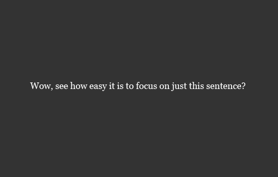
image via here
Read more about whitespace here.
3. Hierarchy is a big deal
Hierarchy is incredibly important in design. While it’s tempting to cram every cool element you want to show off on your homepage, or every little detail into a logo, people can only focus on one thing at a time. It’s a designer’s job to move people’s eyes around the space they are designing to have them focus on specific things at specific times. This comes from having an intentional hierarchy and good layout.
And speaking of general layout, design on a grid. Grids are helpful because they organize information in logical ways that the brain can quickly process. Design is communication; we want to clearly communicate messages to our audiences.

Image via here
In the above image, which do you read first? Probably the word “hierarchy.” After that, which information do you read next? You’ll likely read the elements of hierarchy from top to bottom, because the only thing differentiating any of them are their placement. They’re the same size and weight, spaced evenly apart — but our eyes are trained to read left to right, top to bottom.
This is my favorite case study about hierarchy and design elements, and here’s a fun example of the importance of grids.
4. Content and design work hand in hand
Content, or the specific copy, images, and ideas that are to be designed, are crucial to the actual design. Typography is the art and technique of arranging type (definition here).
Designers are very specific with typography; we even make sure each letter looks good in between the letters on either side (this is a real thing! It’s called kerning). While these micro-details seem to be unimportant to many, they are the details that can take a design from average to incredible.
Learn more about design and content here, and remember that you want to prevent awkward mishaps!

5. Design should be people-focused
Interestingly, it’s a common belief that design simply entails making things pretty.
While aesthetics should absolutely be a result of the design process, designers actually create with the purpose of functionality; they design with the user in mind.
The interesting reality is that when engaging with brands, people are generally self-centered. In this context, I’m not talking greed; people are just very practical. No one will care about your brand until that very specific moment they need you, so make it about them, not you. No one thinks about Pepsi until they’re thirsty; no one thinks about eyewear companies until their glasses break.
When designing a website, we often talk with our clients about engaging their audience with a story. No one will care about a new product, but they can be convinced that the product can fill a need that the audience has.
6. “Design is the silent ambassador of your brand”
The late designer Paul Rand once said this, and it is absolutely true as a proclamation and a warning.
Anything you put online connected with your brand becomes part of your brand. Content, imagery, typefaces, anything — is your brand. It is what people relate with your brand, which is why good design is so important.
Allowing a valuable design process to take place at the beginning of a project is crucial for brand consistency. Every image, typeface, and color, coupled with every piece of copy written should sound like the same person. Your brand should take shape and sound cohesive.
//
So that’s it! That’s all you ever need to know about design. Well, at least that’s enough to make your next bake-sale flyer the best thing that’s ever hit your neighborhood bulletin.
What are some tips that you’ve found to be helpful?